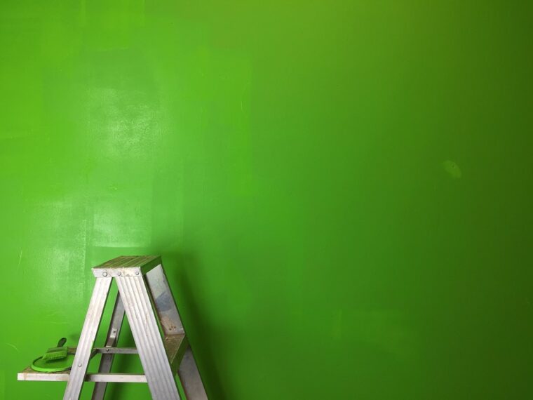
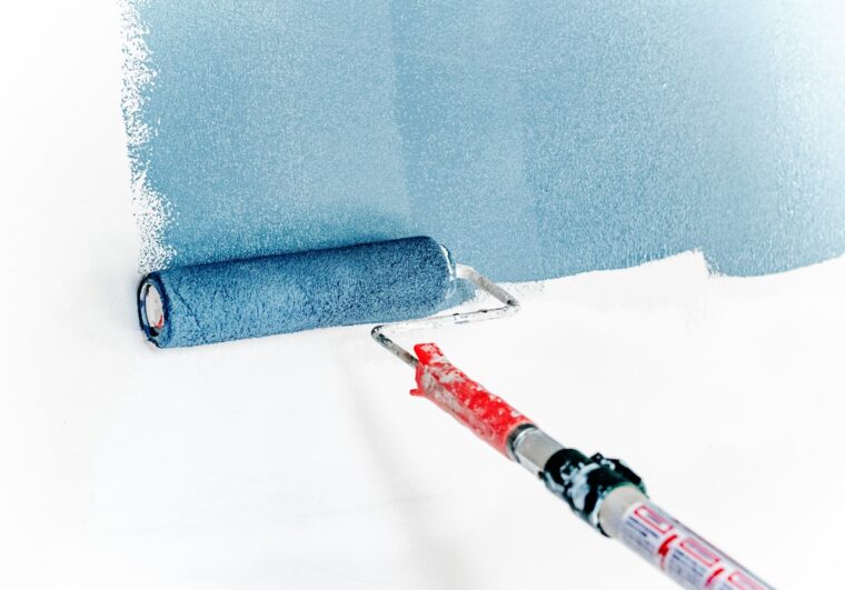
Your home is your sanctuary – the place you feel safest, both physically and emotionally. But your haven needs protecting too, and the best way to care for your home is with a fresh coat of paint. The good news is that it is possible to choose paints that make a long-term commitment to protect the walls of your home. However, the sheer number of options of paint types, qualities, colors, and combinations available in the market can be overwhelming.
In addition, we have the option to choose paints that are durable or eco-friendly, anti-pollution or those that never fade. To top all that, the pandemic has made us even more conscious of welcoming guests without inviting in any pathogens carried by them. Fret not, for there are paints that are specially made to keep the growth or transmission of disease-causing germs and viruses in check.
While you can keep your interior walls protected, the exterior of your home has exposure to extreme weather conditions like harsh sunlight and heavy rainfall, and it also needs protection from the adverse effects of dust, dirt, and other pollutants. For this, it is best to protect your home with temperature-resistant coatings and waterproof paint. Superior quality paints can also increase your home’s resistance to algal and fungal growth.
Top 8 Tips for Choosing the Right Paint Colors
Despite the features and quality of the paint you choose, colors are what help your walls really stand out. Here are a few things to consider while choosing the perfect combination of exterior and interior paints for your home.

1. Check Your Décor and Furniture
Each of your rooms may have a different color or combination. Consider choosing the accent color based on the décor and furniture in the room. You may be conservative and choose a lighter shade of the color of your furniture. It is an excellent choice if you have decorative or upholstered furniture that you wish to accentuate. For rooms with a simpler décor, be adventurous and select a complementary or even a contrasting shade. You could even opt for a textured finish. Finally, consider painting a poster board and placing it against the wall to check how good it looks with the room décor.
2. Remember the Flooring
To choose the perfect colors for your rooms, consider the flooring. For instance, you can choose a light color for the walls if you have dark wooden flooring in your drawing-room. If your flooring has undertones, you can choose the pastel shades of classic neutrals, like antique almond or hazel cream. Dark blue, violet and orange can elevate the look of floors with white tiles. In rooms that have marble flooring, consider a dark color, like earth fire or magnificent brown.
3. Want Your Room to Look Bigger?
There may be rooms in your home that are quite compact. Choose bright or pastel color combinations like white, light blue, and pale yellow, as these reflect more light and make the room appear more spacious. For rooms that are large but have less furniture or décor, choose dark colors for a warm and cozy look.
4. How Much Light Enters Your Room?
You first need to check how well your rooms are naturally lit. For rooms that get less natural light, you should choose light or bright color combinations, as these reflect more light. For example, you can paint the entire room with a single pastel color or choose a dark color for walls that receive more light and a light shade for poorly lit corners.
5. The 3-Colour Rule
First, choose only three colors from the paint palette. Then try a 6:3:2 ratio to use pastel, intermediate, and dark hues, respectively. It should give you the perfect colour combination for your home. You may try a virtual painter tool to help pick out the right colours. If you feel skeptical of being able to choose the right combination, simply ask an expert.
6. Learn How Undertones Work
When two or more colours mix to create a new colour, the undertone refers to the colour used below the mass tone. For example, a beige that is created with more green has a green undertone. If more red is used, it has a pink undertone. There are cool and warm undertones. Hues of blue and green typically make for cool undertones. Shades of red and yellow usually form warm undertones.
7. What Look Do You Wish to Go For?
Finally, your home showcases your taste. If you want your space to look airy and light, explore bright pastel shades like sheer pink, sunrise pink, or intermediate shades like tea rose or coral beige. For a goth appeal, try dark shades like rainbow pop or iced apricot or accent shades like bright wine or plum passion. If you like minimalism, choose neutral shades. For a bubby look, choose vibrant colours.
8. Let the Colour Theme Be Consistent
It’s fun experimenting with different colours. Just ensure that the colour combinations in various rooms of your home follow a theme. First, ensure that the basic colour themes on your exterior and interior walls are consistent.
The checklist doesn’t end here. Consider speaking to a colour consultant before beginning your paint job. Use a virtual painter tool to know exactly how your room’s interior or your home’s exterior will look after it has been painted with the chosen colours. You can try Berger Paints Virtual Painter Tool on bergerpaints.com to see how a particular shade or a combination of different shades will look on the walls of your house. If you’re still unsure, use different paint samples on the walls of different rooms to pick your most preferred colour combination.